A Personal Prediction of the Top 5 Web Design Trends for 2019
With 2019 fast approaching the speculation as to what web design trends will be taking the spotlight in the new year has begun. There are plenty of predictions out there with a multitude of examples. Having done my own research, I have compiled a list of the top 5 web design trends I believe will make the rounds in 2019. This is by no means a completed list. Trends ebb and flow throughout the year and some of these web design trends have already made an appearance in some very popular, high traffic websites. Let me know what you think of my list and what additions or subtractions you have in the comments.

AI Chatbots
More and more large companies are investing in AI-driven chatbots to engage with customers. A study by Octane AI shows that up to 60% of people who receive a message from a Facebook Messenger chatbot click on links provided by the bot. With a successful newsletter campaign receiving around a 15% clickthrough rate it’s no wonder why chatbots are becoming so popular. One of the reasons for the success of chatbots could be the feeling of engagement. The days of email being the king of online personal communication are over. Especially with younger audiences, DM’s, or direct messages, are more engaging and more likely to be read immediately. Most chatbot provided links are clicked within the first ten minutes according to some statistics. AI Chatbots are likely to remain prevalent until spammers successfully integrate them into their set of tools and they go the way of email today.

via MailChimp
Serif Fonts
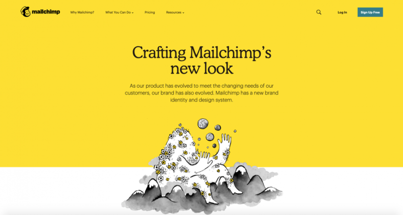
It has always been used the serif fonts are better used in print and sans-serif in digital media. However, web design convention was made to be broken. Very high profile sites, such as MailChimp, are using serif fonts as an attention grabber. Using these kinds of fonts as headings can give your website a more classic feel and make it easier for users to skim through your page. Using serif fonts in digital media is by no means a new style. Online news organizations have been using them almost since their conception. The Wall Street Journal is an excellent example of how serif fonts can be used online. It gives the impression of reading a physical newspaper by using traditional fonts with a creme colored background. Like with any trend or style, one must take a hard look before implementing it on a live website. Make sure that the style is right for your business.

via papersizes.io
Greyscale Color Palettes
I have personally always been a big fan of greyscale color palettes in web design. A large percentage of website rely on color as a way to keep users engaged with their content, so pulling off a very monochromatic website can be difficult. The layout of elements on a page becomes the more enticing part. The contrast between text and the background is also increased, making it easier for people with vision impairments to read. The use of color is another important stylistic choice. Using a harsh color, like red, against a monochromatic backdrop draws a lot of eyes. Using color as a way to grab attention to certain elements can be incredibly useful.

Mobile Focused Design
It’s been a known fact in the web design industry for years the mobile phones make up a significant percentage of internet traffic. Ensuring your website isn’t just mobile friendly, but mobile-focused is as important as ever. Mobile-focused design puts mobile at the highest priority. That means you design for phones and tablets first and then adapt your website to fit on laptops and desktops. It can be difficult for a lot of developers to make the switch. In my own personal experience mobile has always been an afterthought. I designed websites to look good on mobile but never made it my main priority. Getting used to mobile-focused design is imperative in our current technological landscape.

via iota.org
Organic, Abstract Shapes in Design
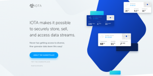
A design trend I really would like to catch on in 2019 is the use of organic, abstract shapes in web design. The website iota.org is an excellent example of how these kinds of shapes can be incorporated. Although they don’t offer a whole lot of utility other than to emphasize other elements, they make your website more interesting to look at. Keeping users engaged with your content is one of the main struggles of a designer. Using something eye-catching the makes people think, “Wow, this is cool!” will help you achieve exactly that. While it may seem daunting to incorporate these design elements into your current website, the payoff is a better, more interesting website.
